
Xooper
Brand Identity + Mobile App UI/UX Design
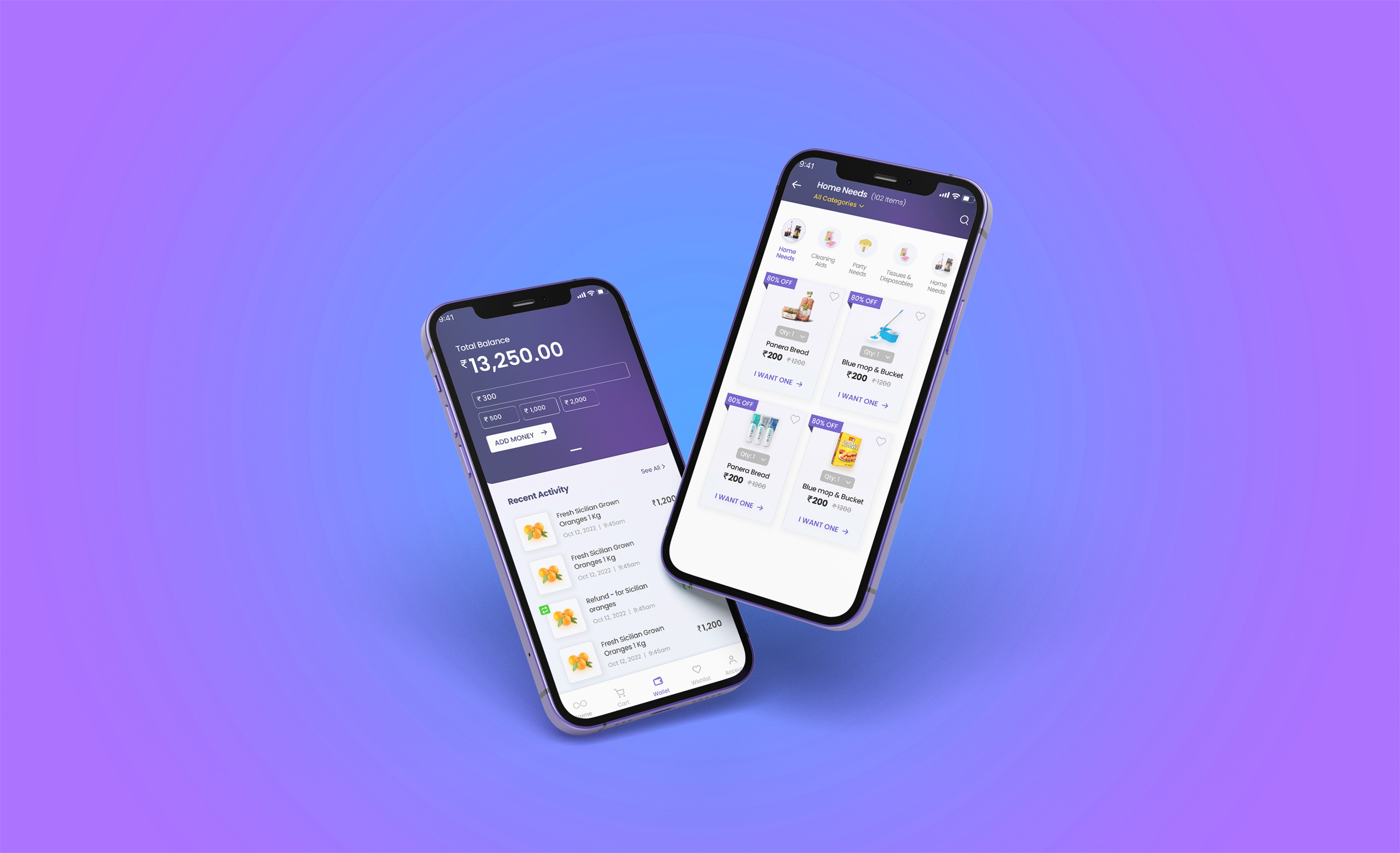
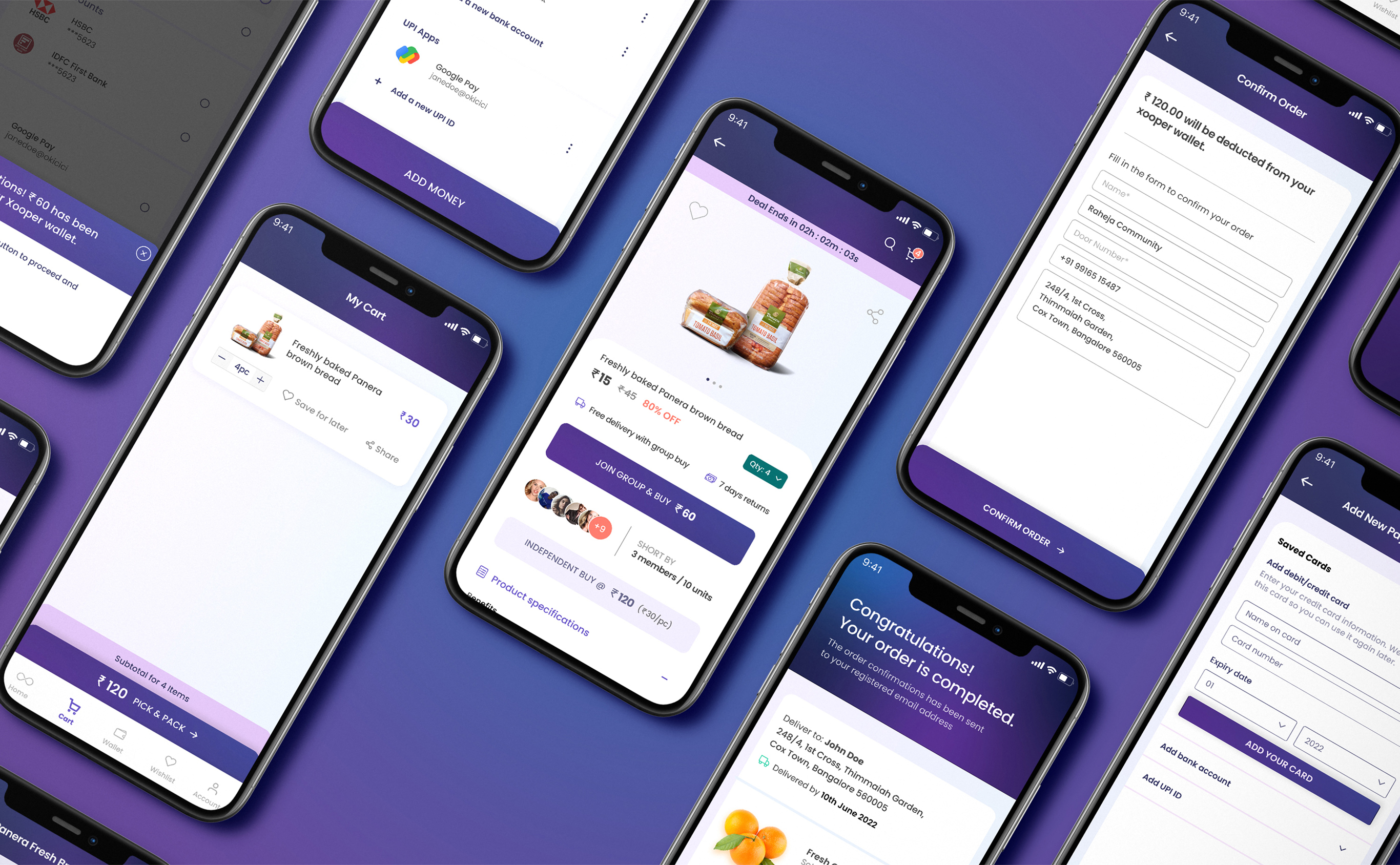
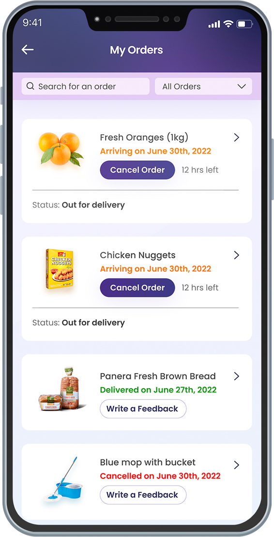
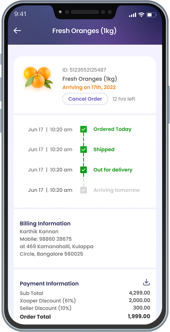
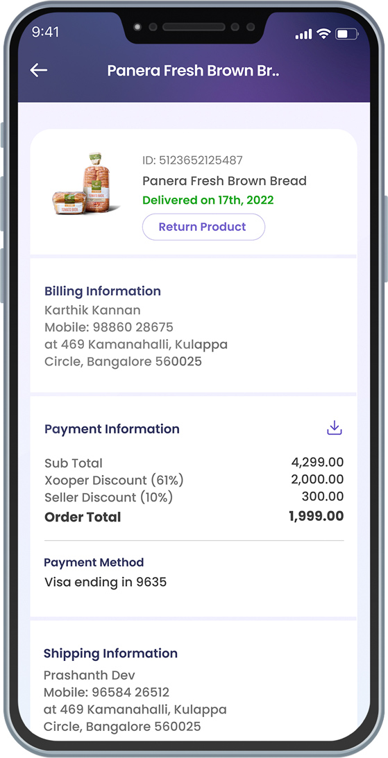
Xooper is a daily and occasional-use product-sharing platform for people to come together and rent or sell items of interest. Our work for Xooper was fairly simple—and complex. We had to improve on the company's existing logo and design the entire Xooper web/mobile application. This was to be a combination of branding at its very best and research-based UI/UX work.
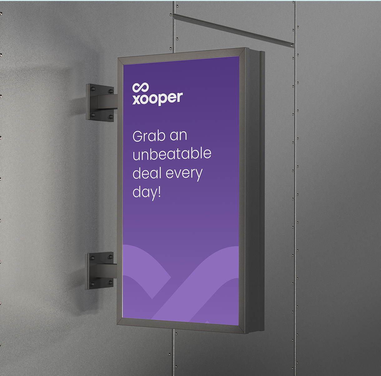
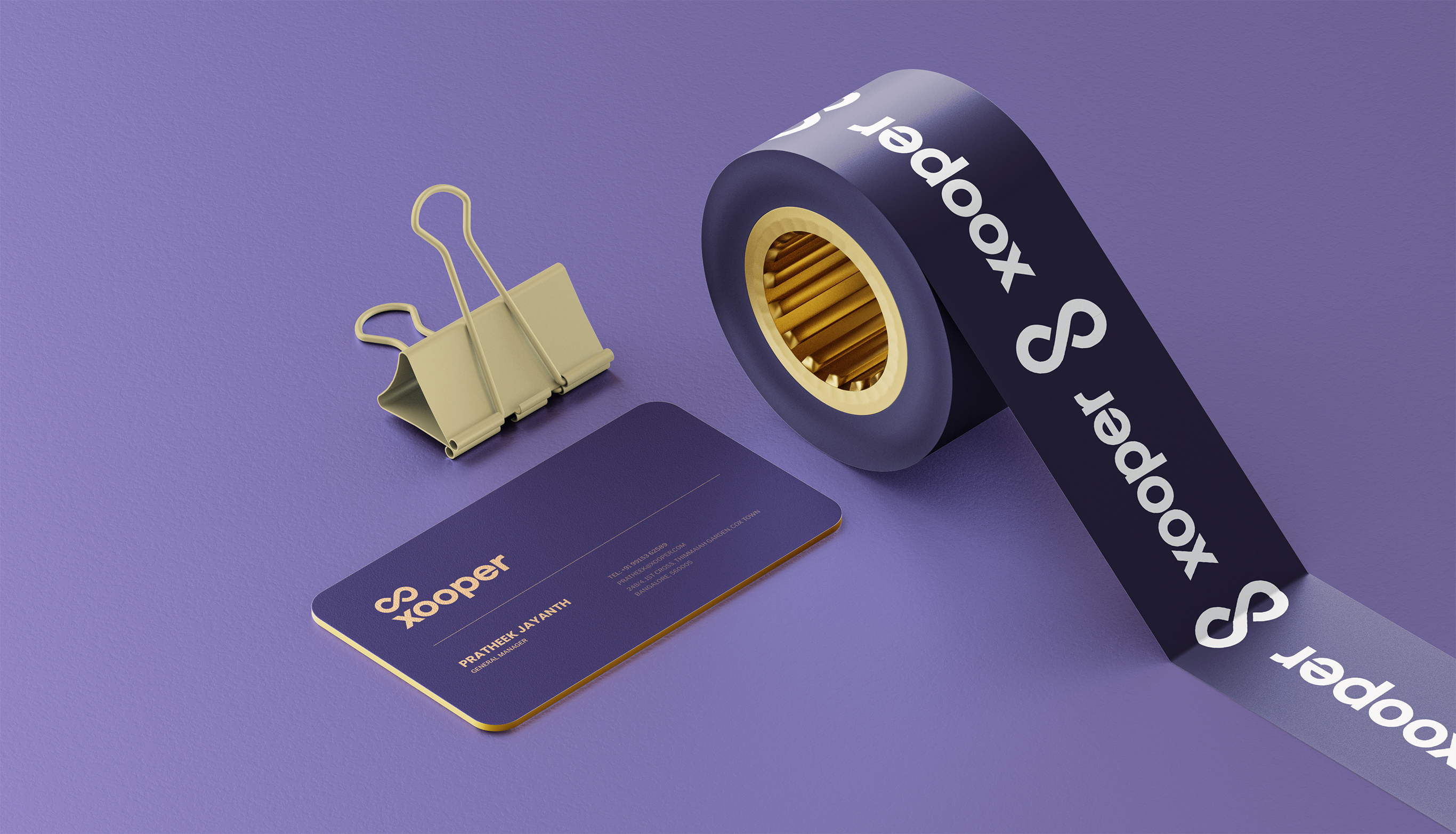
Inspired by the "infinite" possibilities of Xooper's business model, we took the company's then-current imposing infinity-symbol brandmark and toned it down into a more effortless and friendly loop. The typeface we chose for this brand facelift was a rock solid sans serif to denote stability and trust.
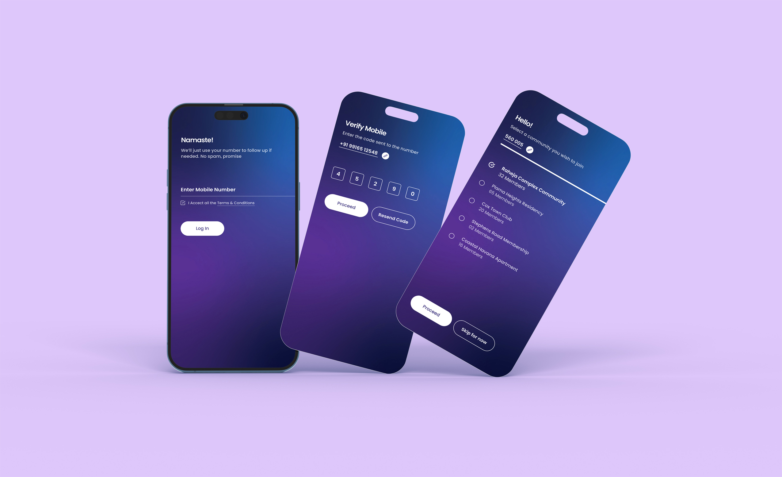
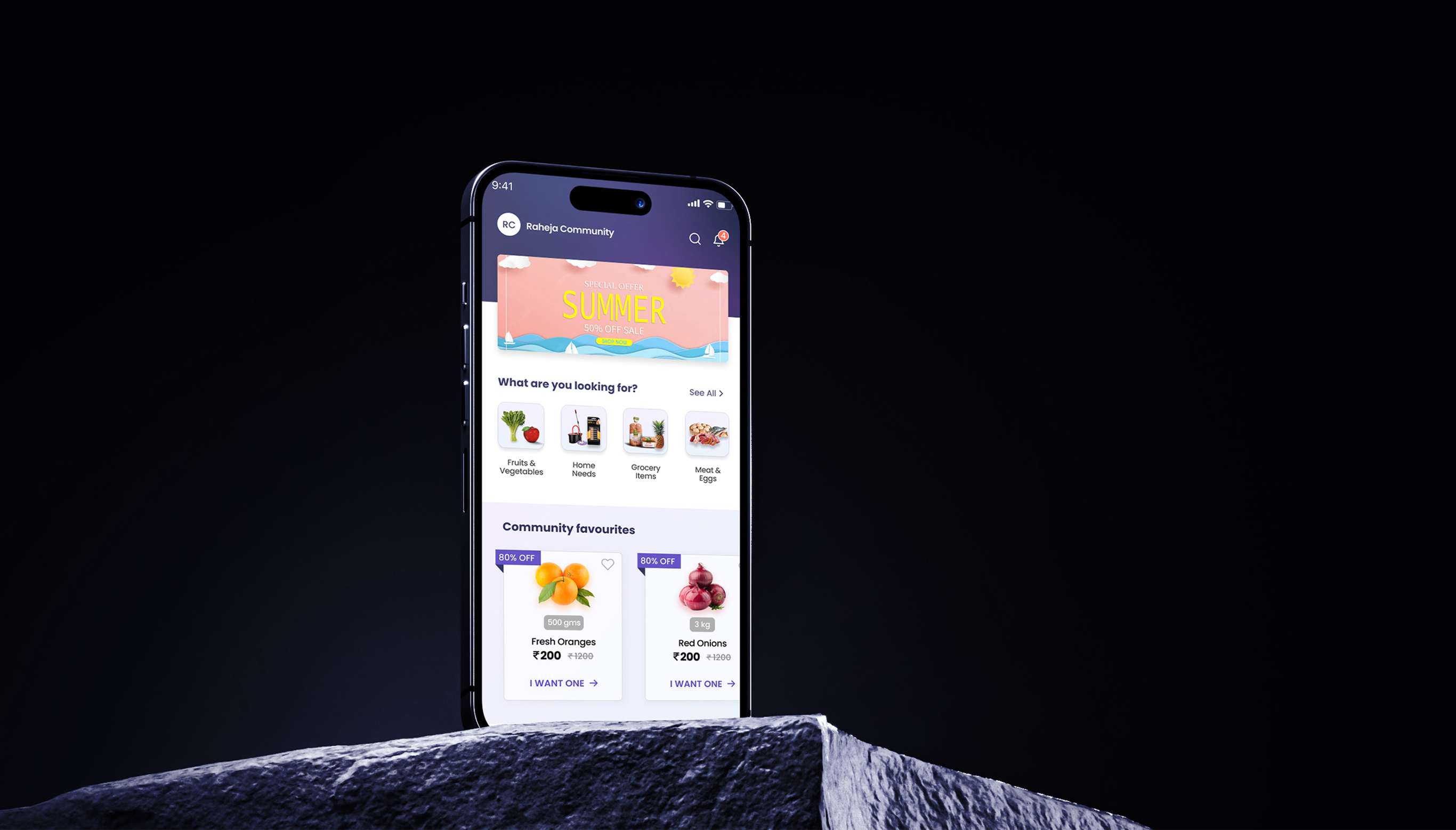
For the web/mobile application design, we stuck to a process and ensured we had a lot going on: brainstorming sessions, research, journey maps, competitor analysis, prototyping, usability testing, accessibility evaluation, reducing cognitive load, defining features and components, etc. Long story short, we left no stone unturned and churned out a world-class finished product in record time.


If it's working out for you, you're probably out working.
contact@unplugged.agency