




Superbloom Studios
Brand Identity
A strong brand identity has to be skillfully built and then stitched together perfectly. Starting right is of paramount importance. Finishing touches count and details matter. It's like how a fashion designer takes a piece of fabric and works on it to disrupt an entire industry. For Superbloom, we wanted to sail on such waters, where the idea was to have a look that could be open to interpretation and yet be precisely positioned.
Inspired by the name of the company i.e., Superbloom Studios, we thought of what a "super bloom" could look like and then art instantly got its direction. Being a business that dealt with leadership and inclusivity programs aided by AI, Superbloom’s logo had to be smart and sophisticated without coming anywhere close to resembling a bouquet or a garden of flowers.
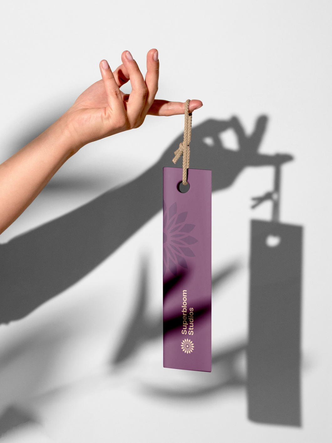
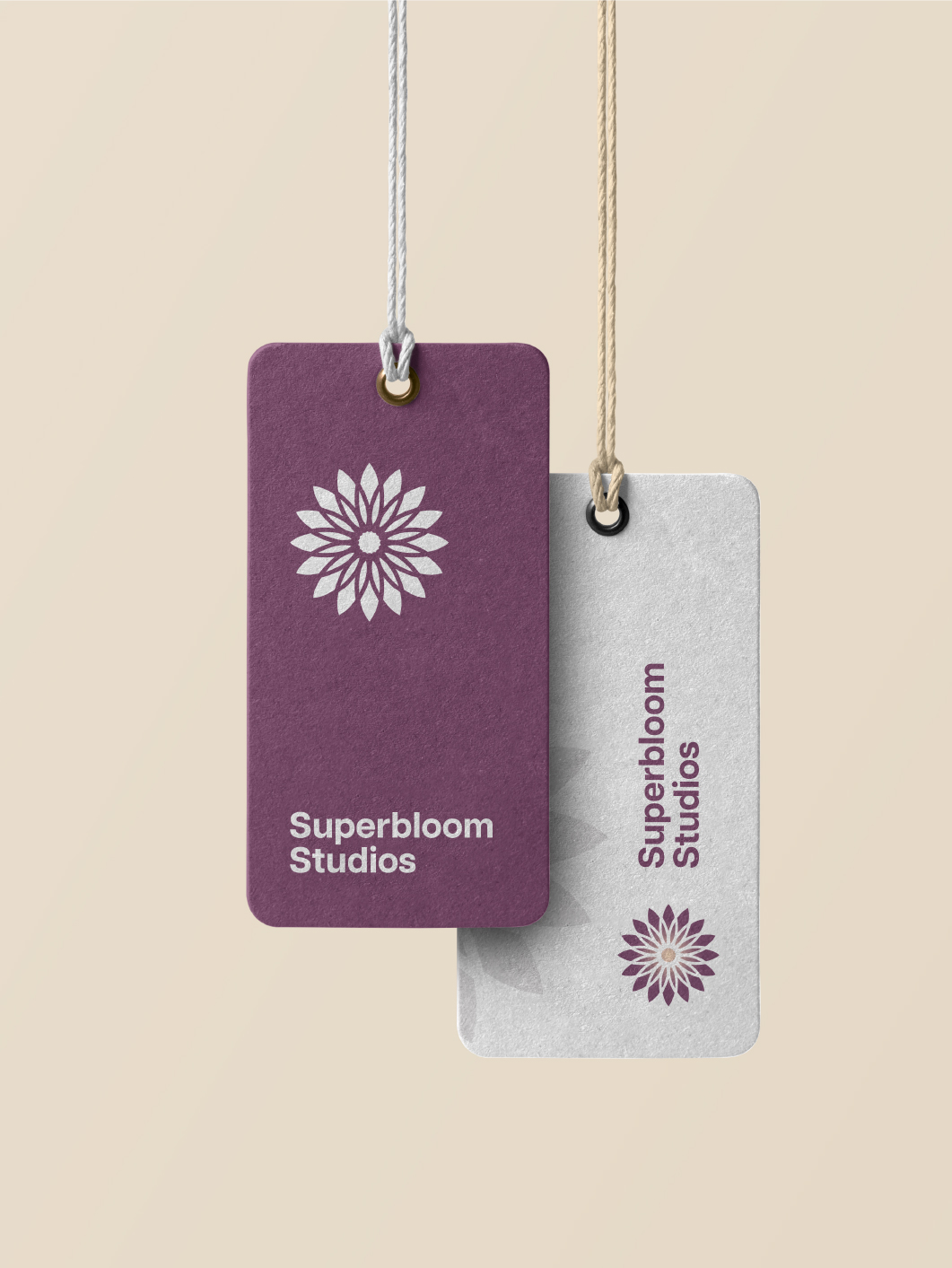
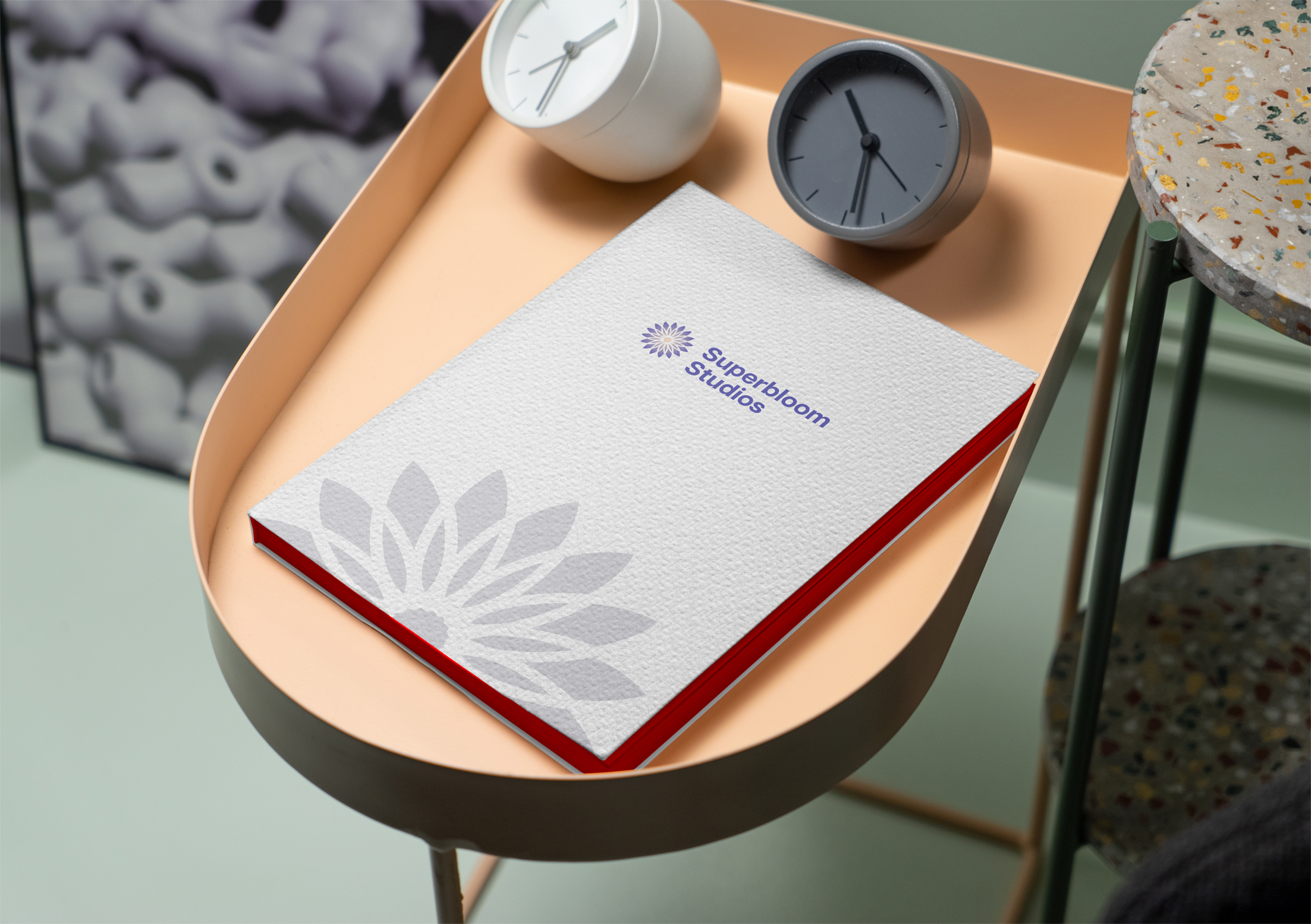
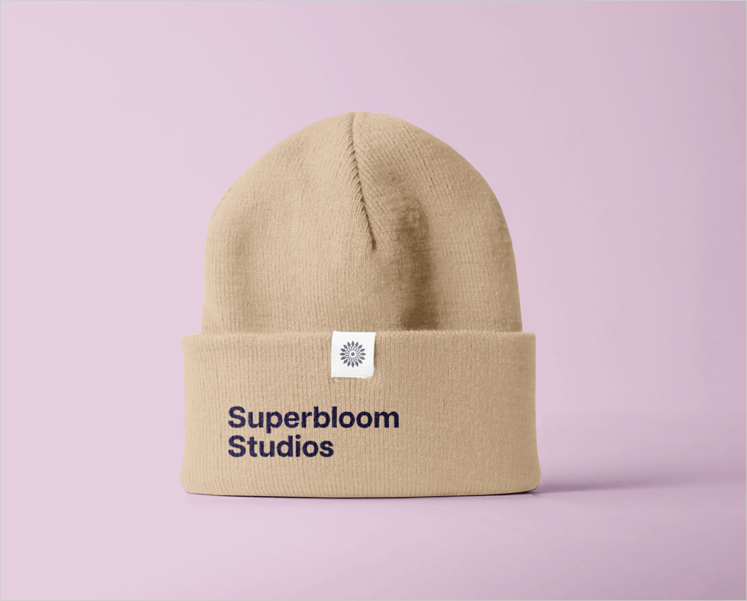
A couple of internal workshops later, pens and pencils met paper and then paper met the screen to eventually have a look that matched the intensity of the brief. A structured and symmetrical floral burst paired with an understated typeface was the fruit of our labor. And everything was the way Superbloom liked it to be: thoughtful, functional, and inviting - just like the company’s vision.


If it's working out for you, you're probably out working.
contact@unplugged.agency