

Decision Foundry
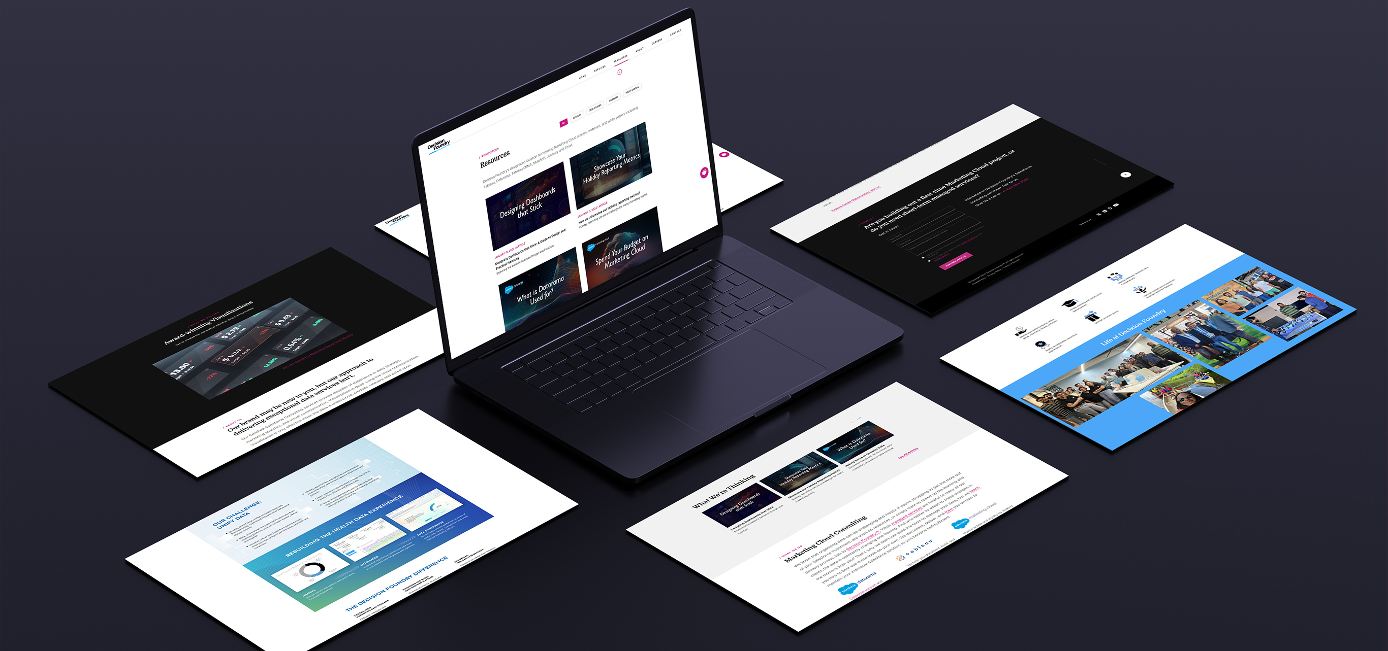
Brand Identity + Website UI/UX Design
Decision Foundry is a client we have been associated with for a couple of years now. The company exists to enable organization-level decision-making that's backed by a true understanding of voluminous data. They are like they say are—"Data Consultants", and when the data guys need anything designed they usually come to us.
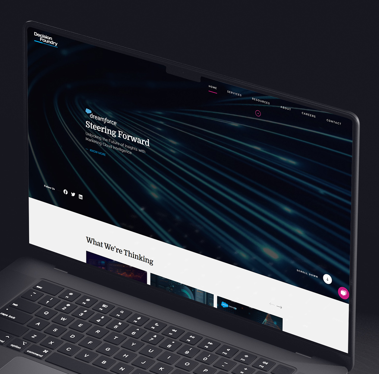
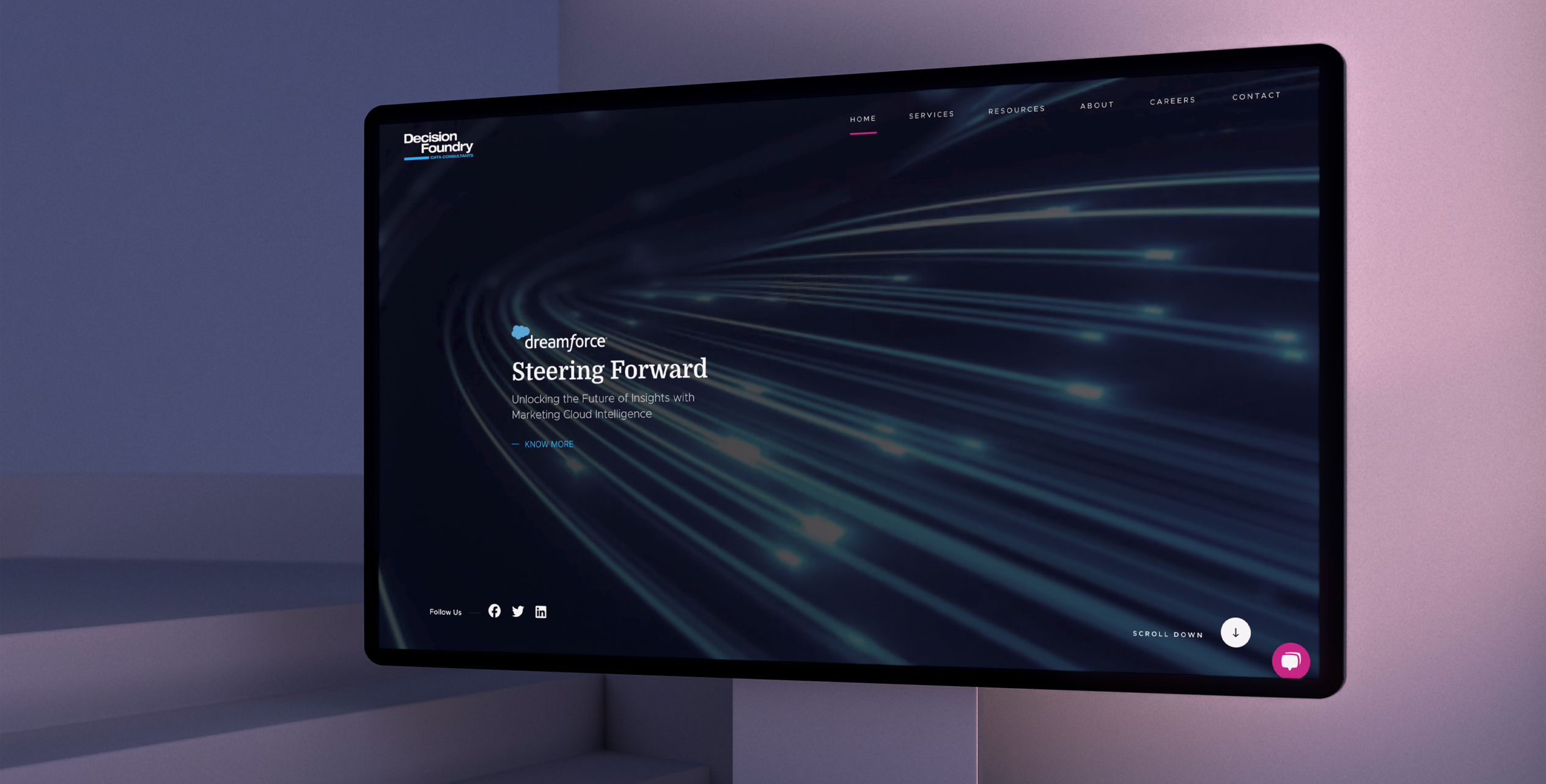
It all began when the CEO sent us an email with a design team's most dreadfully exciting line—"I need a new logo and website really quick!" Being industry colleagues and well-wishers to each other, how could we possibly say no - even if it meant churning out a new brand identity and website literally overnight.
Needless to say, we got cracking - we've always liked a zesty challenge and this was exactly that.
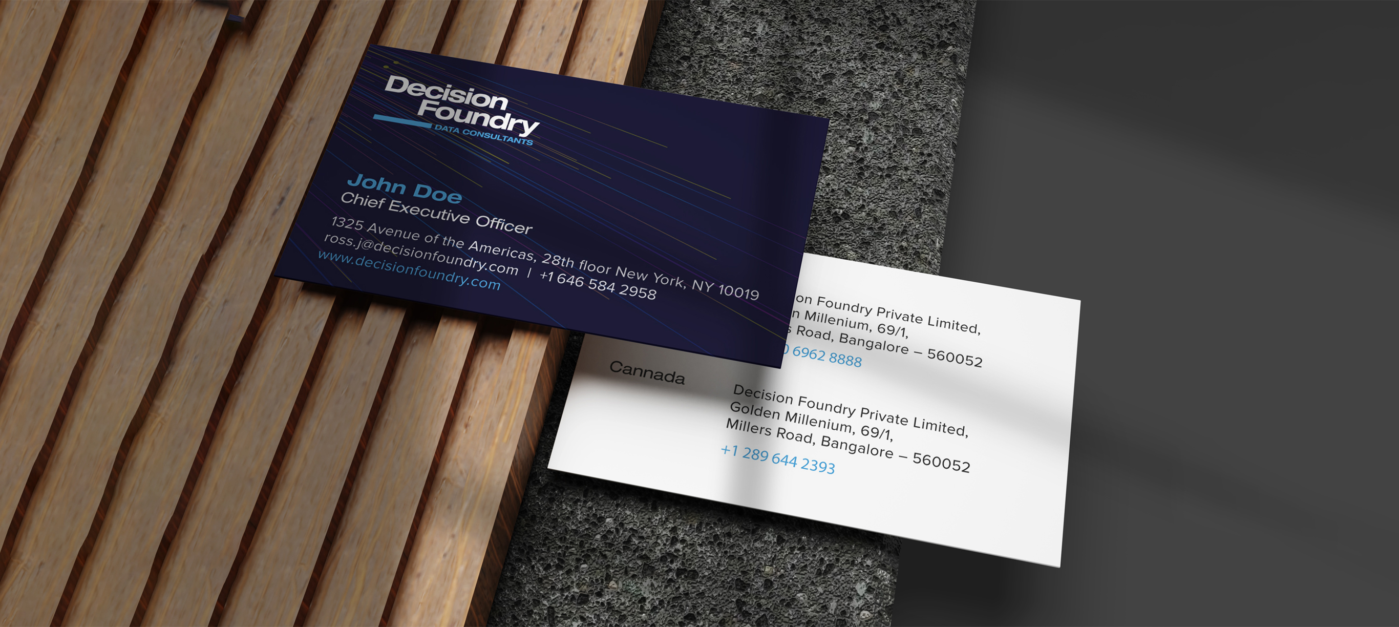
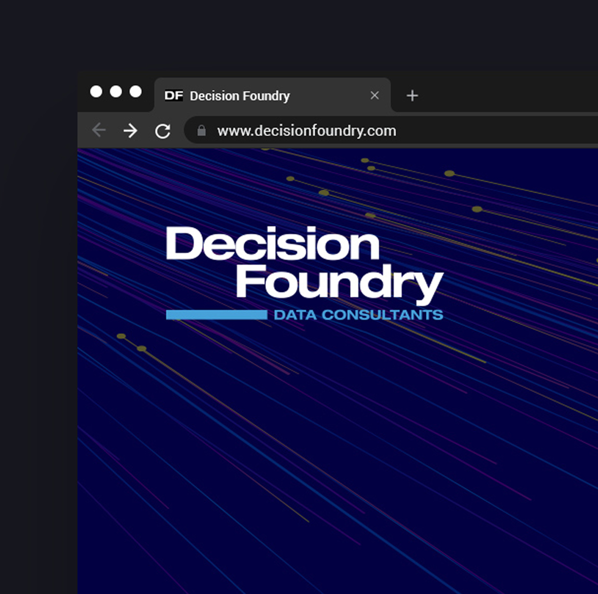
From the ground up, we knew we had to come up with a look that was global and visually easy to digest. Something that was done with a lot of care and consideration, with a seasoning of "Oh, I could have done that.", which is what makes a logo relatable, think: Google, Microsoft, Uber, Target, National Geographic, etc. Overall, our thought was quite rational. Inspired by "building blocks of data", we used the classic rectangular block and negative space to design Decision Foundry's "brand" new logo and then carved out a path for all of the brand assets + a really cool corporate website. Phew!





If it's working out for you, you're probably out working.
contact@unplugged.agency